arviz.plot_ppc#
- arviz.plot_ppc(data, kind='kde', alpha=None, mean=True, observed=None, observed_rug=False, color=None, colors=None, grid=None, figsize=None, textsize=None, data_pairs=None, var_names=None, filter_vars=None, coords=None, flatten=None, flatten_pp=None, num_pp_samples=None, random_seed=None, jitter=None, animated=False, animation_kwargs=None, legend=True, labeller=None, ax=None, backend=None, backend_kwargs=None, group='posterior', show=None)[source]#
Plot for posterior/prior predictive checks.
- Parameters:
- data
InferenceData arviz.InferenceDataobject containing the observed and posterior/prior predictive data.- kind
str, default “kde” Type of plot to display (“kde”, “cumulative”, or “scatter”).
- alpha
float, optional Opacity of posterior/prior predictive density curves. Defaults to 0.2 for
kind = kdeand cumulative, for scatter defaults to 0.7.- meanbool, default
True Whether or not to plot the mean posterior/prior predictive distribution.
- observedbool, optional
Whether or not to plot the observed data. Defaults to True for
group = posteriorand False forgroup = prior.- observed_rugbool, default
False Whether or not to plot a rug plot for the observed data. Only valid if
observedisTrueand for kindkdeorcumulative.- color
list, optional List with valid matplotlib colors corresponding to the posterior/prior predictive distribution, observed data and mean of the posterior/prior predictive distribution. Defaults to [“C0”, “k”, “C1”].
- grid
tuple, optional Number of rows and columns. Defaults to None, the rows and columns are automatically inferred.
- figsize
tuple, optional Figure size. If None, it will be defined automatically.
- textsize
float, optional Text size scaling factor for labels, titles and lines. If None, it will be autoscaled based on
figsize.- data_pairs
dict, optional Dictionary containing relations between observed data and posterior/prior predictive data. Dictionary structure:
key = data var_name
value = posterior/prior predictive var_name
For example,
data_pairs = {'y' : 'y_hat'}If None, it will assume that the observed data and the posterior/prior predictive data have the same variable name.- var_names
listofstr, optional Variables to be plotted, if
Noneall variable are plotted. Prefix the variables by~when you want to exclude them from the plot.- filter_vars{
None, “like”, “regex”}, defaultNone If
None(default), interpret var_names as the real variables names. If “like”, interpret var_names as substrings of the real variables names. If “regex”, interpret var_names as regular expressions on the real variables names. A lapandas.filter.- coords
dict, optional Dictionary mapping dimensions to selected coordinates to be plotted. Dimensions without a mapping specified will include all coordinates for that dimension. Defaults to including all coordinates for all dimensions if None.
- flatten
list List of dimensions to flatten in
observed_data. Only flattens across the coordinates specified in thecoordsargument. Defaults to flattening all of the dimensions.- flatten_pp
list List of dimensions to flatten in posterior_predictive/prior_predictive. Only flattens across the coordinates specified in the
coordsargument. Defaults to flattening all of the dimensions. Dimensions should match flatten excluding dimensions fordata_pairsparameters. Ifflattenis defined andflatten_ppis None, thenflatten_pp = flatten.- num_pp_samples
int The number of posterior/prior predictive samples to plot. For
kind= ‘scatter’ andanimation = Falseif defaults to a maximum of 5 samples and will set jitter to 0.7. unless defined. Otherwise it defaults to all provided samples.- random_seed
int Random number generator seed passed to
numpy.random.seedto allow reproducibility of the plot. By default, no seed will be provided and the plot will change each call if a random sample is specified bynum_pp_samples.- jitter
float, default 0 If
kindis “scatter”, jitter will add random uniform noise to the height of the ppc samples and observed data.- animatedbool, default
False Create an animation of one posterior/prior predictive sample per frame. Only works with matploblib backend. To run animations inside a notebook you have to use the
nbAggmatplotlib’s backend. Try with%matplotlib notebookor%matplotlib nbAgg. You can switch back to the default matplotlib’s backend with%matplotlib inlineor%matplotlib auto. If switching back and forth between matplotlib’s backend, you may need to run twice the cell with the animation. If you experience problems rendering the animation try settinganimation_kwargs({'blit':False})or changing the matplotlib’s backend (e.g. to TkAgg) If you run the animation from a script writeax, ani = az.plot_ppc(.)- animation_kwargs
dict Keywords passed to
matplotlib.animation.FuncAnimation. Ignored with matplotlib backend.- legendbool, default
True Add legend to figure.
- labeller
labeller, optional Class providing the method
make_pp_labelto generate the labels in the plot titles. Read the Label guide for more details and usage examples.- ax
numpyarray_like ofmatplotlib Axesorbokehfigures, optional A 2D array of locations into which to plot the densities. If not supplied, Arviz will create its own array of plot areas (and return it).
- backend
str, optional Select plotting backend {“matplotlib”,”bokeh”}. Default to “matplotlib”.
- backend_kwargs
dict, optional These are kwargs specific to the backend being used, passed to
matplotlib.pyplot.subplots()orbokeh.plotting.figure(). For additional documentation check the plotting method of the backend.- group{“prior”, “posterior”}, optional
Specifies which InferenceData group should be plotted. Defaults to ‘posterior’. Other value can be ‘prior’.
- showbool, optional
Call backend show function.
- data
- Returns:
- axes
matplotlib Axesorbokeh_figures - ani
matplotlib.animation.FuncAnimation, optional Only provided if
animatedisTrue.
- axes
See also
plot_bpvPlot Bayesian p-value for observed data and Posterior/Prior predictive.
plot_loo_pitPlot for posterior predictive checks using cross validation.
plot_lmPosterior predictive and mean plots for regression-like data.
plot_tsPlot timeseries data.
Examples
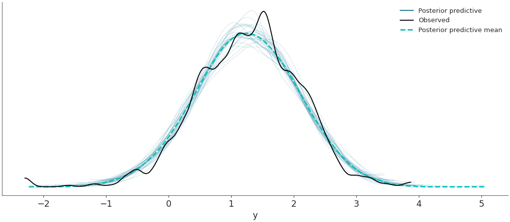
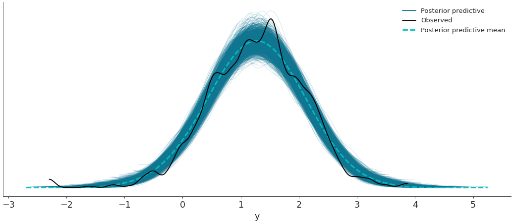
Plot the observed data KDE overlaid on posterior predictive KDEs.
>>> import arviz as az
>>> data = az.load_arviz_data('radon')
>>> az.plot_ppc(data, data_pairs={"y":"y"})
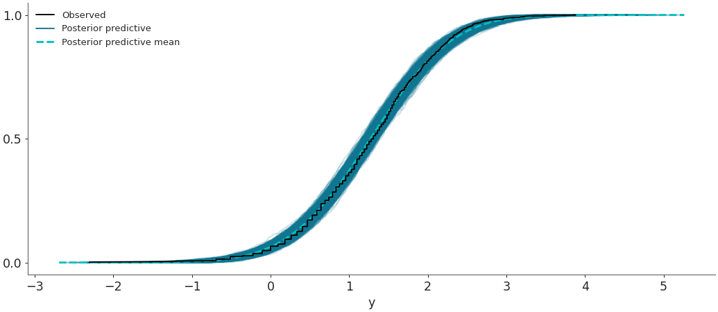
Plot the overlay with empirical CDFs.
>>> az.plot_ppc(data, kind='cumulative')
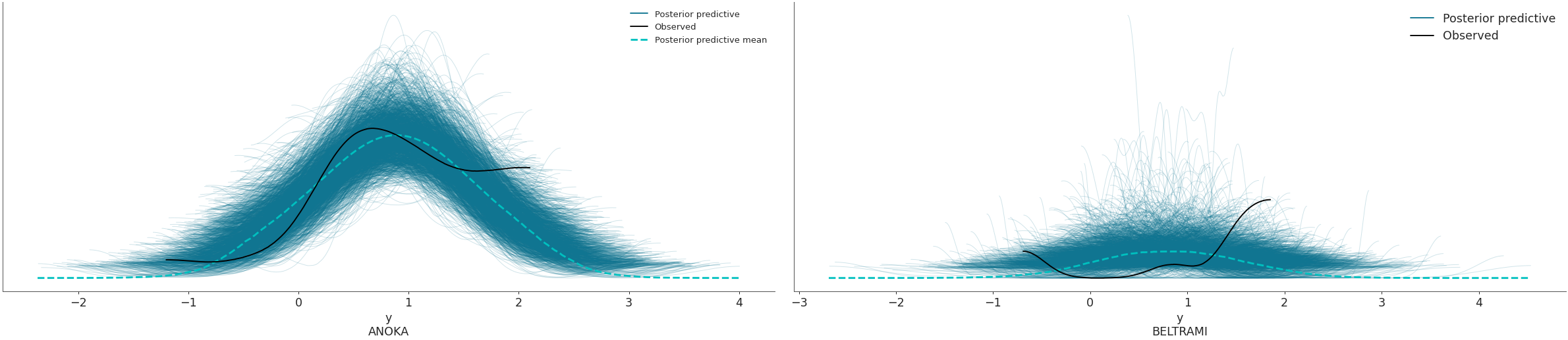
Use the
coordsandflattenparameters to plot selected variable dimensions across multiple plots. We will now modify the dimensionobs_idto contain indicate the name of the county where the measure was taken. The change has to be done on bothposterior_predictiveandobserved_datagroups, which is why we will usemap()to apply the same function to both groups. Afterwards, we will select the counties to be plotted with thecoordsarg.>>> obs_county = data.posterior["County"][data.constant_data["county_idx"]] >>> data = data.assign_coords(obs_id=obs_county, groups="observed_vars") >>> az.plot_ppc(data, coords={'obs_id': ['ANOKA', 'BELTRAMI']}, flatten=[])
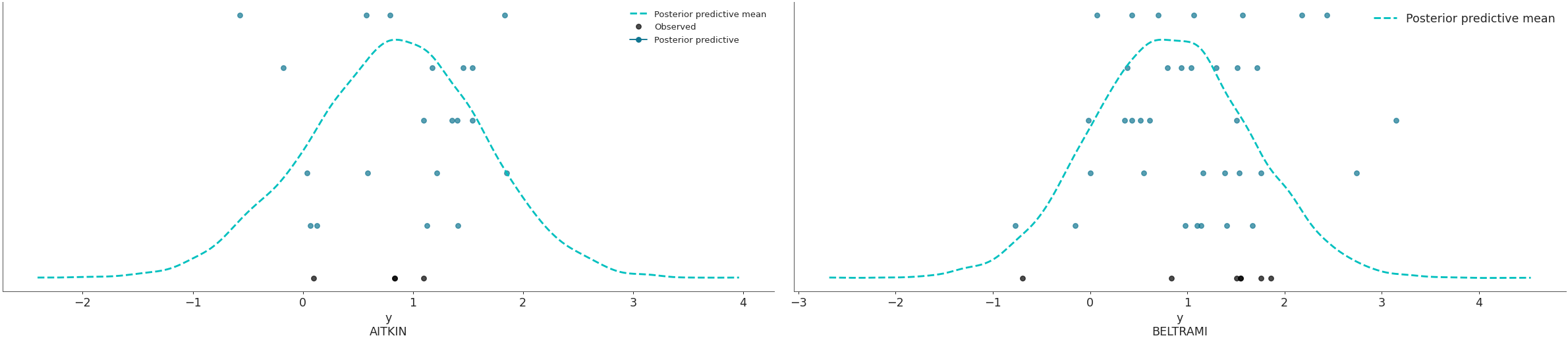
Plot the overlay using a stacked scatter plot that is particularly useful when the sample sizes are small.
>>> az.plot_ppc(data, kind='scatter', flatten=[],
>>>             coords={'obs_id': ['AITKIN', 'BELTRAMI']})
Plot random posterior predictive sub-samples.
>>> az.plot_ppc(data, num_pp_samples=30, random_seed=7)